
You upgraded from a 10x10 to a 10x20 expecting more impact. More room for conversations, more space to show off your product, more presence on the floor. Instead, you're standing in it during setup thinking something feels... off. It looks emptier than the smaller booth did, not bigger.
This happens more often than exhibitors expect, and it's rarely about having "not enough stuff." It's almost always about how the space is used. Here's why it happens and what actually fixes it.
Why Doubling the Space Doesn't Double the Impact
A 10x10 forces decisions. You only have room for one or two focal points, so every element in the booth is doing real work. A 10x20 removes that constraint, and without a plan, the extra square footage just becomes distance between things.
The most common mistake with a 10x20 trade show booth rental is treating it like a bigger version of a 10x10: the same counter, the same single backdrop, the same handful of graphics, just spread across double the floor. The result is a booth that feels sparse instead of spacious, with visitors walking through open space rather than being pulled toward anything.
The fix isn't adding more stuff. It's rethinking the layout so the space has structure, not just square footage.
Fix #1: Create Zones, Not Just One Big Area
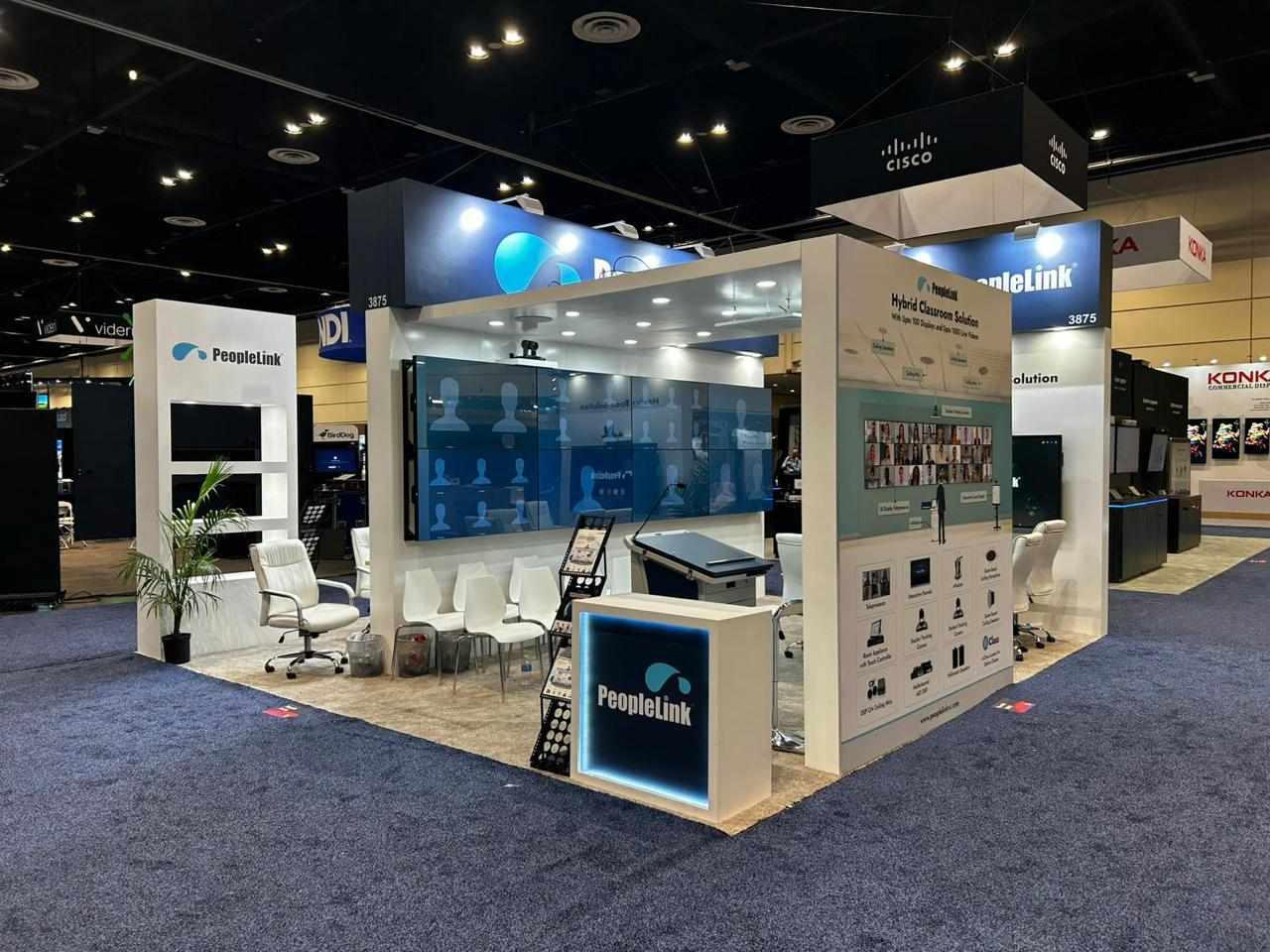
The exhibitors who make a 10x20 feel intentional almost always break the space into purposeful zones instead of one continuous display. A common, effective layout looks like this:
· A welcome zone near the entrance with your brand messaging and a clear visual hook
· A demo or product zone where visitors can interact with what you're showing
· A conversation zone with seating or a counter for deeper discussions away from foot traffic
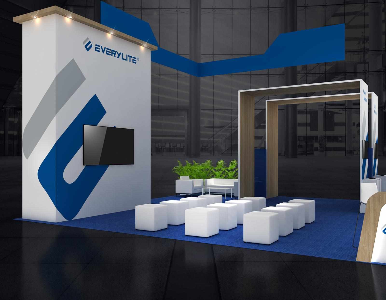
This is where a 10x20 modular trade show booth earns its keep. Modular systems are built around reconfigurable panels and structures, so you can physically define these zones with height, color or structure changes instead of leaving them as open floor. A visitor should be able to look at the booth and immediately understand where to go and why.

Fix #2: Use Height, Not Just Width
A 10x20 gives you more floor space, but a lot of exhibitors forget it can also give you more vertical space. A flat, low-profile layout across 20 feet reads as empty because there's nothing drawing the eye upward. Adding varied height, a taller backdrop at the center, hanging signage, or elevated graphics panels, gives the booth a sense of scale that flat layouts can't achieve, even with the same amount of material.
This is one of the clearer advantages of a 10x20 modular trade show display: most modular systems are designed to scale vertically without needing an entirely custom structure, so you can add height in specific spots without redesigning the whole booth.
Fix #3: Don't Center Everything
A single centered backdrop with nothing else around it is one of the fastest ways to make a wide space feel hollow. Instead, think in terms of sightlines from multiple angles, since visitors will approach a 10x20 from more directions than a 10x10. Anchor points at both ends of the booth, not just the middle, keep the space feeling full no matter which side someone walks up from.
Fix #4: Match Furniture Density to the Footprint
This is a subtle one, but it matters. Furniture that looked proportional in a 10x10 can look sparse and scattered in a 10x20 if it's just spread out to fill the space. Instead of spacing the same handful of pieces further apart, group them into the zones mentioned above. A cluster of two chairs and a small table near a demo screen reads as an intentional meeting spot. The same two chairs pushed to opposite corners just look lost.
Fix #5: Let Lighting Do Some of the Work
Lighting is one of the most overlooked tools for making a bigger booth feel complete. Uneven lighting across a wide space creates dark, dead zones that make the booth feel emptier than it is. Targeted lighting on your focal points, product displays, key graphics, your logo wall, draws attention exactly where you want it and makes the whole space feel more considered, even if the physical footprint hasn't changed.

What This Looks Like in Practice: Layout Ideas Worth Considering
If you're planning your next 10x20 trade show booth rental, here are a few layout directions that tend to work well, depending on your goals:
The Split-Function Layout
Half the booth is a product or demo display, the other half is a lounge-style meeting area. Works well if your sales process involves longer conversations after an initial product interaction.
The Center-Anchor Layout
A tall, central structure (tower, hanging sign, or feature wall) with open space and smaller displays on either side. Good for brand-awareness-focused exhibitors who want visibility from across the hall.
The Corner-Flow Layout
If your booth has two open sides (a corner or peninsula space), design entry points from both directions with a natural path that funnels visitors toward a central feature. This avoids the "walk straight through and out the other side" problem that plagues open layouts.

The Multi-Station Layout
Best for companies showing multiple products or services. Break the 10x20 into two or three smaller stations, each with its own signage and staff member, rather than one long, undifferentiated space.
Whichever direction you choose, this is exactly the kind of planning worth doing with your rental provider before the design is finalized, not after you're standing in an empty-feeling booth on setup day.
The Real Difference Between "Big" and "Full"
A 10x20 doesn't feel empty because it's too much space. It feels empty because the space hasn't been given a structure. The exhibitors who get the most out of 10x20 trade show displays aren't necessarily spending more, they're planning zones, height, sightlines and lighting with the same intentionality they'd bring to a smaller booth, just applied across a bigger canvas.
If you're upgrading from a 10x10 and want to avoid this exact problem, it's worth having a layout conversation early, ideally while the design is still on paper, not after the booth is already built.

Write a comment ...